JA-Renovated Kitchen Featured in Mansion Global
/Seattle Homeowners Took Their Kitchen From 1950s Modernism to 21st-Century Minimalism
The couple turned to Johnston Architects to expand their view while respecting their home’s sleek style
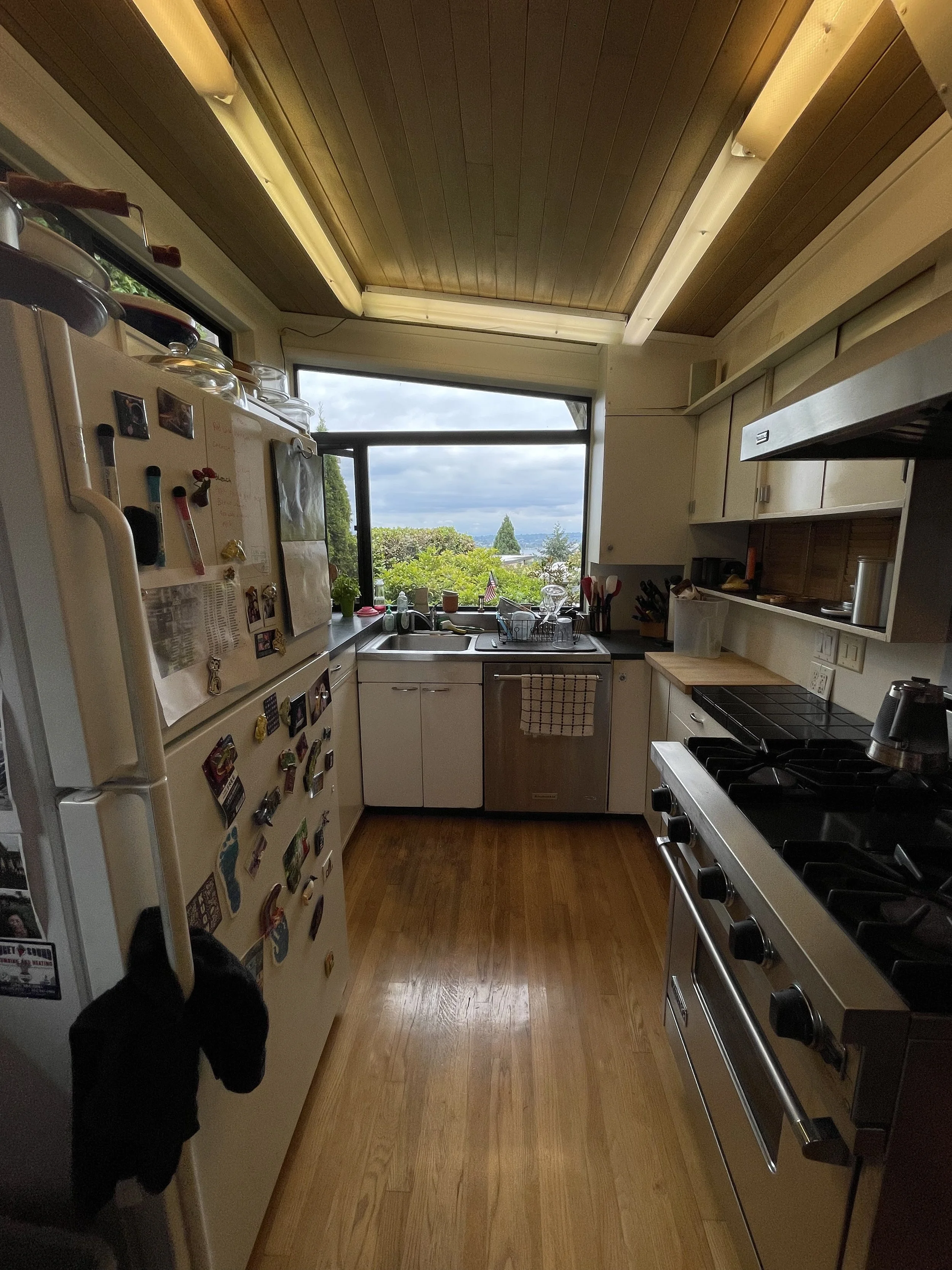
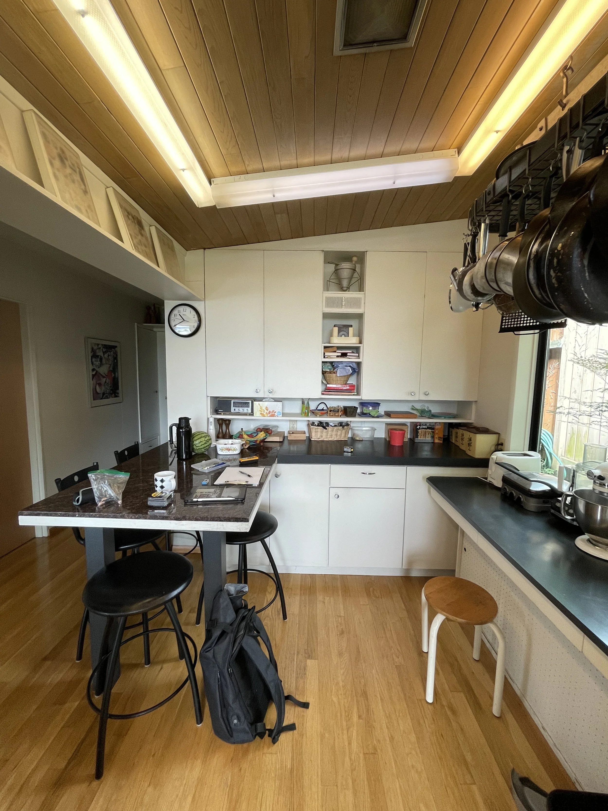
by Michele Lerner for Mansion Global / Originally Published on December 14, 2023In the 1950s, an architecture professor at the University of Washington, her students, and her husband, an engineer, built a Northwest Modern-style house with a galley-style kitchen that included a small pass-through to the dining area. Stuart and Maria Kahn, the second owners of the Seattle property, bought it in 1988 and lived with that cramped mid-century kitchen for more than 30 years.
“The oven was on one side and the refrigerator was on the other side of this narrow space, so we couldn’t open both at the same time,” said Maria, 71, a retired scientist. “The biggest change now that our kitchen has been remodeled is that we can both work together.”
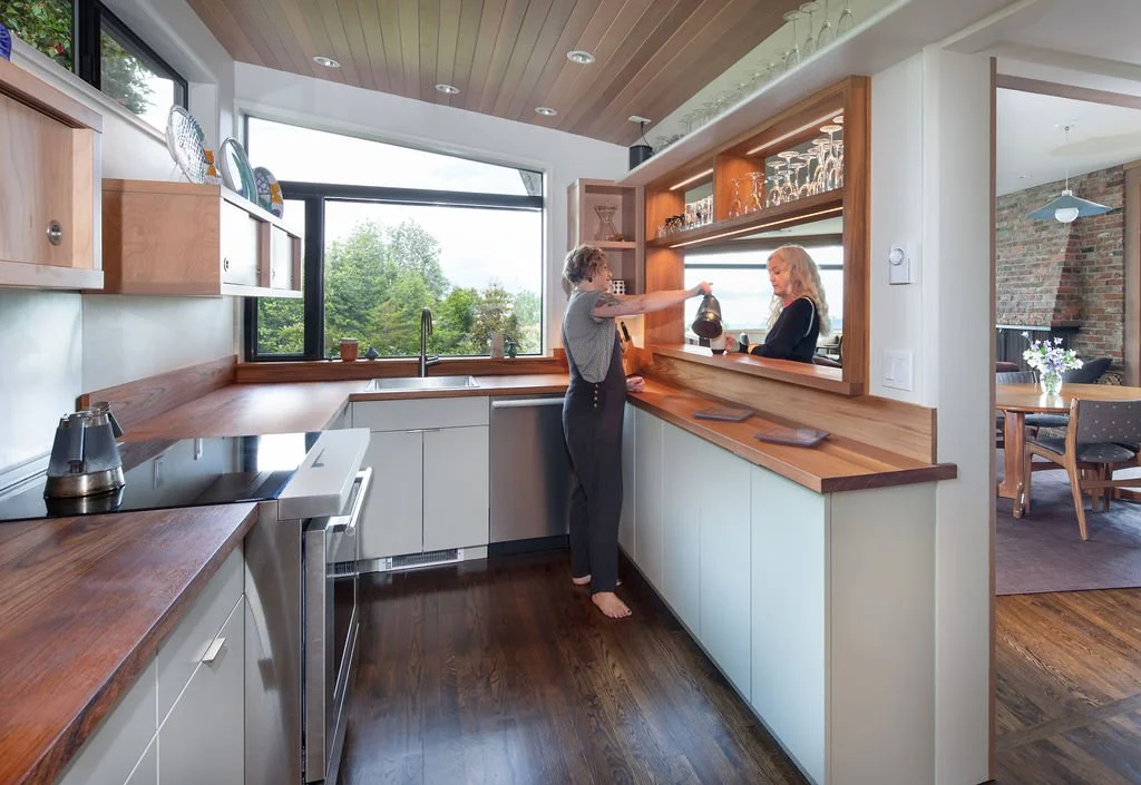
While that may mean a lot to the Kahns, perhaps even more striking is that the reconfiguration of the kitchen increased its efficiency and preserved their view of the Cascade Mountains.
the home’s original kitchen was cramped and closed off from the rest of the house / photo by ja
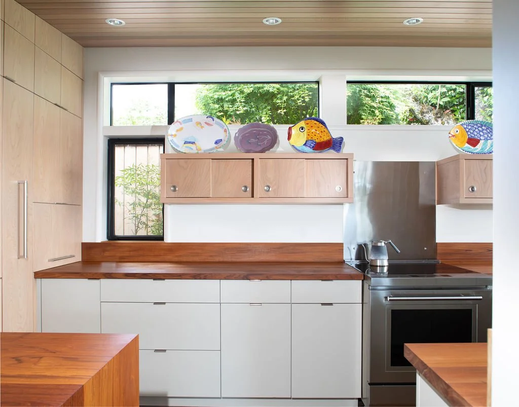
The new kitchen preserves the views from over the sink and drasticaly opens up the pass-through to the mid-century home’s living spaces, grabbing more views of the cascade mountains / photo by quanta collectiv
A large gas range and hood partially obstructed the mountain view, so the Kahn’s architect, Alison Walker Brems, a Partner with Johnston Architects in Seattle, designed their kitchen with a new location and a range with downdraft ventilation.
“The kitchen is visible from the living areas and has a pass-through to the dining area that also partially obstructed sightlines in the house,” Brems said. The challenge was to increase the connection between the kitchen and the living area while maintaining the footprint of the kitchen and complementing the home’s architectural style.
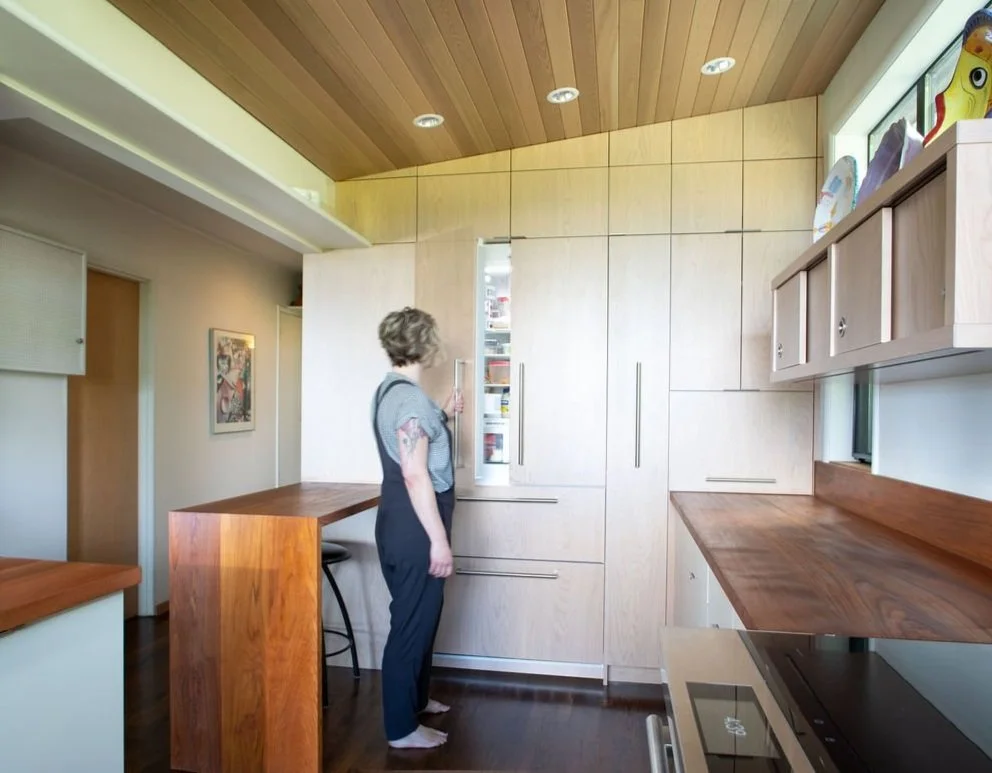
the “secret” wall conceals a full sized refrigerator, pantry, appliance garage, and dramatically added to the kahn’s kitchen storage / photo by quanta collectiv
Her solution: a “secret” kitchen wall with panels that match the finish of the original plywood walls.
“He made such amazingly precise cuts,” Brems said. “He input the dimensions of the cabinets and kitchen in 3-D, then relied on the computer to cut the material to 1/256th of an inch. The results are absolutely perfect, which is really admirable because houses are never perfectly square.”
The pass-through to the living area now has a larger opening for better communication between the rooms. One kitchen window was removed to add a cabinet, but Stuart said there’s still plenty of natural light.
“We had a string of loud fluorescent lights that Alison removed and replaced with LED lighting overhead and under cabinet lighting,” said Stuart, 70, a retired physician. “The wood ceiling had to be removed and replaced to install the recessed lights.”
The Kahns opted for teak counters with a teak backsplash to match the abundance of wood throughout their home and stained their wood floors to a darker shade. “In a small space, a darker floor makes the room feel larger,” Brems said.
The Kahns spent about $200,000 on their kitchen remodel, including some ancillary projects such as refinishing the floors on the main level and adding wood trim to their windows.
“Our kitchen was finished about a year ago, but we still can’t get over how beautifully it turned out,” Stuart said. “Instead of having to work around the appliances and the clutter, it’s an inviting place to be now.”
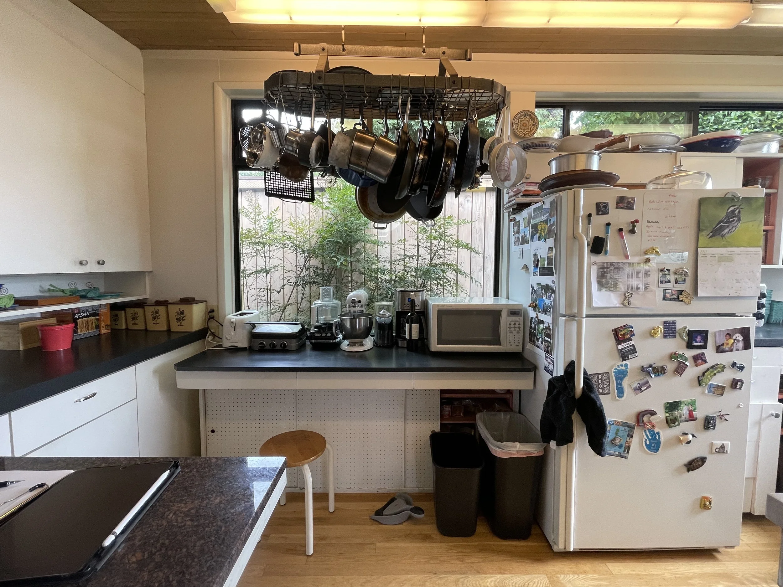
the original 1950s kitchen had been adjusted over time but lacked efficiency / photo by ja
the redesigned kitchen provides consistency of counter heights and cabinetry. The custom upper “slider” cabinets pay homage to the original storage options. / photo by quanta collectiv
Q&A
I would describe the aesthetic as… “Northwest Modernism to complement the existing style of the house,” said Brems.
My advice to others is… “Be patient and let your contractor run the show,” Maria said. “Make sure you hire people you can communicate with easily and who are transparent with you throughout the process.”
The biggest surprise was… “The lack of clutter on the counters,” Maria said. “This kitchen is so efficient even though it’s the same size as before.”
My favorite post-renovation feature is… “The teak counters and backsplash,” Stuart said. “They are so warm and fit with the aesthetic of the whole house, which has lots of wood walls and wood floors.”
The most dramatic change was… “Our ability to hide so much of the kitchen behind cabinets,” Brems said. “The west wall of the kitchen hides three pantries, a refrigerator and an appliance garage, plus more storage.”
A favorite material we discovered during the process was… “Nano Indirect Fixture LED under cabinet lighting that’s only 5/16” tall and 7/8” wide,” Brems said. “Keith Griffin, the cabinetmaker, told me about them.”
The footprint of the kitchen was unchanged but the efficiency of the new space drastically reduced clutter / photo by ja

